
When we started refining Nagster’s mobile interface, we ran into a deceptively small design problem: what should our buttons actually look like?
The functionality was already the interesting part. Nagster is our custom reminder app built with .NET MAUI, with a card-based interface that we want to keep simple and easy to understand.
But once an interface has more than one action, color starts carrying meaning.
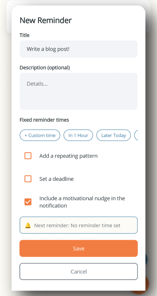
We decided on a straightforward color schema:
- Orange for accepting, confirming, adding, and other positive actions
- Gray for canceling or stepping away from an action
- Red for deleting, rejecting, or other destructive actions
This is not an attempt to invent a revolutionary design system. Quite the opposite. We wanted something predictable enough that a user can look at a Nagster screen and understand the likely outcome before reading every label.
Why orange became our primary action color
For Nagster, we chose orange as the visual language for moving forward.
Adding a reminder, confirming an action, or accepting something all have roughly the same semantic direction: the user is choosing to make something happen.
Orange gives those actions a strong visual presence without making them look dangerous.
That distinction mattered to us. We did not want the primary action to disappear into a collection of equally styled buttons, but we also did not want every important button to look like an emergency control.
Our rule became fairly simple:
If the user is intentionally creating, accepting, or confirming something, orange is a good candidate.
That gives us a reusable rule instead of choosing a new button color every time we add a screen.
Why cancel is gray
Cancel is a different kind of action.
When someone taps Cancel, they are usually not asking the application to perform the opposite operation. They are saying, “I don’t want to continue with this interaction.”
That is why we chose gray.
Gray is visually quieter than orange. It communicates that the action is available, but it should not compete with the primary action.
Why delete and reject are red
Destructive actions deserve a different treatment.
Deleting a reminder is not just another variation of confirming something. It can remove information, and the user may not be able to recover it easily.
That is where red comes in.
Red has a strong association with danger, errors, warnings, and destructive operations across many interfaces. We are using that existing convention rather than asking users to learn another one.
We do not use red just because something is important
This distinction is worth making.
Red does not mean “important.”
It means potentially destructive or dangerous.
A normal confirmation can be important without being red. In our schema, that remains orange.
This gives us three useful levels of meaning:
| Color | Meaning | Typical action |
|---|---|---|
| Orange | Proceed / accept / create | Add, confirm, accept |
| Gray | Step back / dismiss | Cancel |
| Red | Destructive / reject | Delete, reject |
That is simple enough to remember, which is exactly what we wanted.